September 8, 2021 • 12 min read
Visualize It: Bringing Your Reports to Life with Analytics
In your last presentation, did your data visualizations tell a business story through charts, graphs, and other illustrations — or did your slides fall flat? With the rise of reporting dashboards and data visualization tools, it’s easier than ever for audit, risk, and compliance teams to communicate their day-to-day value, key strategic insights, and business case for additional resources through the power of visualization.
In this episode of AuditTalk, Trent Russell, Founder of Greenskies Analytics and host of The Audit Podcast, breaks down his tried and tested rules for bringing data to life with visualizations, including:
- Examples of ineffective tables, graphs, and illustrations — and ways to improve them.
- Checklists of do’s and don’ts for a variety of data scenarios — when to remove gridlines, how to align your data, strategic uses of color, and more!
- A step by step walkthrough to transform an auto-generated table into an impactful one.
Watch the full AuditTalk video to learn what separates a bad visualization from a great one, and read the can’t-miss highlights below.
How to Use Simple Text
“If I have two data points in this bar graph [in the example], a 12% and then a 29% — those are the percentage of audits that we’re using analytics on from 2019 to 2020. This bar graph is trying to tell a story, and it does that job — just not as efficiently as the simple text example that I’m going to share. With the bar graph, it takes a second to figure out that there’s a 12% and it went up to 29%. What does that mean? When we have one to two data points that we want to call out, simple text is an easy way to tell the story without even having to know how to use any visualization tools. It’s the same story, but it’s a lot easier on the brain to read and understand a big number “29%”, and text that says “of audits had data analytics.” Okay, got it. This is a really easy way to convey the data quickly, efficiently, and effectively. My eyes immediately go to that 29%. It tells me exactly what I want or need to know, or says what I want to tell — and it’s very easy to understand. That’s one of the overarching things about visualizations: make it as easy as possible to understand, take out all the distracting stuff.”
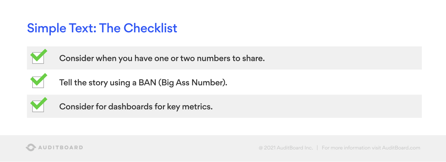
“When you have one or two numbers to share, think about using what’s called simple text, as opposed to a bar graph. Tell a story using a BAN — or big ass number. That is an actual visualization technical term, by the way. You’ll see it a lot of times in dashboards at the top left. then across the top you’ll see three or four KPIs — because that’s the most important piece. Those are the BANs and that’s where your eyes go, to make sure you take in that information. Put them at the top, make them big and bold.”
How to Use Tables
“When it comes to tables, consider whether you have a mixed audience. If you have multiple people from the C-suite and you’re not just presenting to the CFO, they’re going to have different perspectives and care about different things in the data. If you’re presenting it to a mixed audience, then a table might make sense, because they want to read it and pull out the question or the information and get their own perspective on it.”
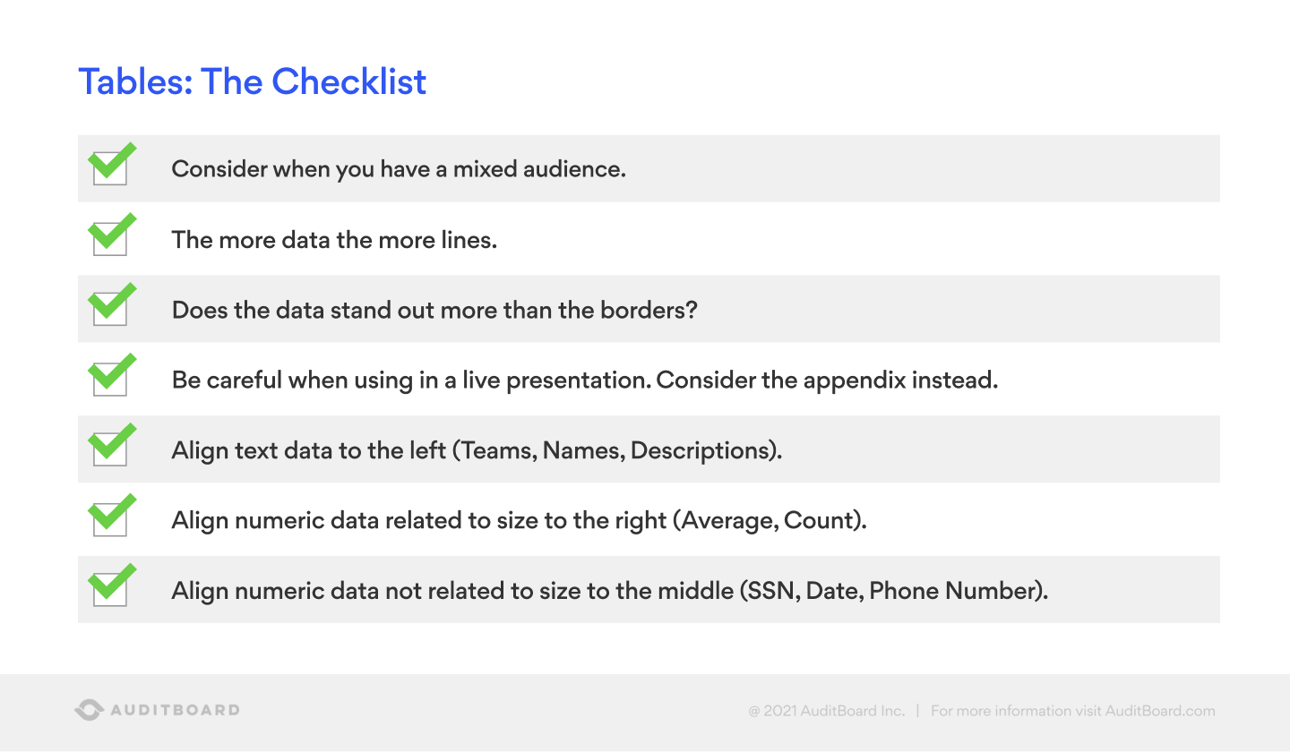
“The more data, the more lines. If you have a lot of data, you can use the multicolor option in Excel to break out the different lines so you don’t have to use your finger to follow it along. When you have a live presentation, if you have a lot of data and it’s in the presentation, you can consider putting the table in the appendix so they can refer to it later.”
“Does the data stand out more than the borders? I like to push all the borders to the back, bring all the data — the star of the show — to the front.”
“You know how there’s maybe one or two things that you remember from the four-ish years that you spent in college? The one thing I remember from an entire Excel class was to align numeric data not related to size — like social security numbers, dates, phone numbers — in the middle. When it comes to text — such as a team’s name, a person’s name, or even descriptions in a Pcard file — push all that to the left. If it’s numeric data like an average or account, or even a dollar amount, push it to the right.”
“These aren’t hard and fast rules, they’re recommendations, so apply your judgment as you go through these. If I showed this to a group of visualization people, half of them would argue until they’re blue in the face that you never do it like that, you always do it like this. So you do need to apply your judgment.”
How to Use Bar Graphs
“The go-to is bar graphs. Everybody understands a bar graph. They convey a message really, really well — especially when I walk you through some of the bar graph rules.”
“[In the example] we just changed three things here: did away with the verticals, changed the color scheme, and changed the title. This is a good example of a few easy things that everyone can do to make bar graphs better, to tell a better story — and ultimately to get what we want or give our audience what it wants to see.”
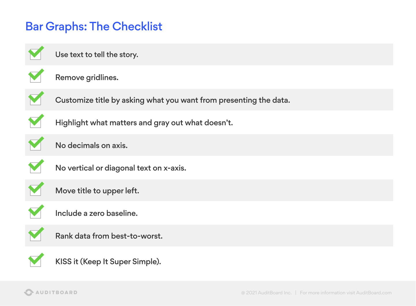
“Use text to tell the story — don’t be afraid to add text just because it’s a graph!”
“Remove the grid lines. It’s super easy to do, and it makes a big difference.”
“Customize the title by asking what you want from presenting the data. In one example the title was Count — that doesn’t really tell you a lot.”
“Highlight what matters and gray out what doesn’t. In one example, we grayed out non-IT certifications, and we highlighted in blue the IT certifications — that’s where we wanted the eyes to go because we wanted the audience to know there’s a gap in our IT competencies.”
“Don’t use decimals on the axis, unless it’s in the scientific community where a quarter of a millimeter makes a huge difference. If something will blow up if it’s a quarter of a millimeter off, then it would probably make sense to include decimals. But a lot of times by default, those will be added, so the axis will be zero, 100.00, 200.00, 300.00… that adds nothing to the visualization, and distracts from the story.”
“No vertical or diagonal text on the x-axis. That was one that I am very much guilty of doing for a long time, because I didn’t know what else to do with it. I would put it at the diagonal, but that’s not how we read. This is one of those things where it doesn’t seem like it’s a big deal, and it’s not a big deal, but an aggregate of everything is distracting.”
“The zero baseline — this is one where I’ve heard some arguments, and they are warranted. I’ve seen examples of this across mainstream media — they will tell their story in a way that works to their audience. It’ll be maybe a 1% increase from 98% to 99% in whatever it is the story they’re trying to tell. If we graph that with a bar graph, you couldn’t even tell if there was a difference there. Maybe the 1% doesn’t really matter. So, they’ll start the axis at 96 so it looks like there’s a huge gap, when it’s just a 1% gap. This is one of those rules where you have to use your judgment. A 1% increase on something that’s $20 billion dollars — that may be a big deal. I wanted to speak more to the ethics, because you can tell a story unethically.”
“KISS it. If you aren’t familiar with the term, it stands for “Keep it simple, stupid.” It’s a business phrase that folks use. That’s a bit harsh for me. I like to say, Keep It Super Simple. The more simple it is, the better it’s going to be.”
How to Use Color
“Rules for color. There are books dedicated to rules for color. Use them sparingly. You don’t have to use every color. Contrast the grays and the colors, the brighter colors for highlighting.”
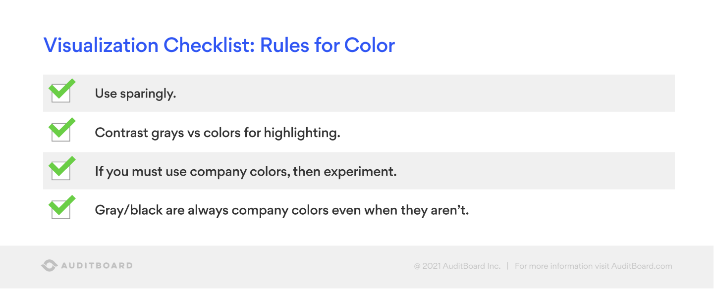
“A question I get a lot of times is about the use of company colors. Experiment with company colors — see how it looks, and if you can tell a story.”
“The rule breaker that I suggest is to use gray, black, and white. Even if they’re not company colors, gray, black, and white are company colors. I’ve used the AuditBoard colors throughout this presentation. The gray that I used isn’t necessarily their gray, but it still works. Even if there was zero gray in there, it still works, because they’re neutral colors.”
Visualization Checklist: Don’ts
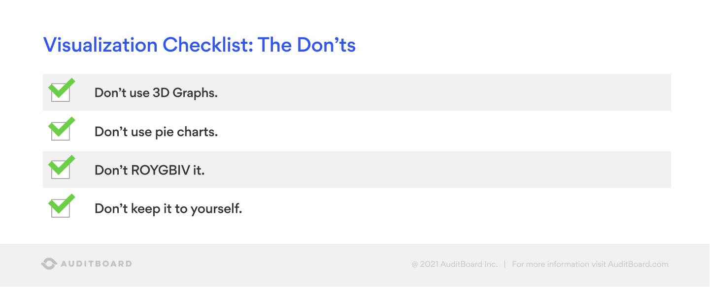
“Among the data visualization community, there is an extreme hatred for 3D graphs and for pie charts. People don’t like 3D graphs because it adds an extra layer of understanding in your brain. It just over-complicates them. I’ve used it one time. Even then I was like, I really don’t want to do this, but I think it’s the best way. I did it and the person went, I don’t know what’s going on. We all kind of stumbled. 99.9% of the time, I’d stay away from 3D graphs.”
“Pie charts are interesting. One reason why people hate pie charts in the visualization community is our brains don’t naturally read the curve of a circle as intuitively relative to the percentage it’s taking up vs a bar graph. It’s just not the way most of our brains work. I’m very guilty years ago of using a pie chart to show something like 200+ items that had gone missing. I thought it looked good. I thought I’d told the story well. The more I learned about it, I can’t believe I actually sent that to somebody. I’m okay with pie charts as long as you put the percentage in or next to each slice — otherwise, it’s very hard to understand what the biggest percentage of the pie is.”
“Don’t ROYGBIV it. ROYGBIV is how a lot of folks learn the colors of the rainbow. Colors of the rainbow are red, orange, yellow, green, blue, indigo, and violet. So, don’t feel like you have to use every color of the rainbow.”
“Don’t keep it to yourself. That’s probably one of the biggest tips. Send it to somebody, ask where their eyes go, ask what their interpretation is!”
Looking for an even deeper dive into data visualizations? Watch the related on-demand webinar. Stay tuned for more AuditTalk videos with audit community leaders about industry issues, insights, and experiences!
You may also like to read


AuditBoard and IAF report: The more you know about AI-enabled fraud, the better equipped you are to fight it

Audit reporting best practices: Guide for audit leaders

Boards are struggling with AI oversight. How internal auditors can help

AuditBoard and IAF report: The more you know about AI-enabled fraud, the better equipped you are to fight it

Audit reporting best practices: Guide for audit leaders
Discover why industry leaders choose AuditBoard
SCHEDULE A DEMO


